Add your own decors: a photo, or your supplier’s material set
No decor collection covers every supplier, and you rarely build in the decor that happens to be built into the software. In KWAL Cabinet Studio you add your own: give it a name and your supplier’s article code, and show the app what it looks like. Your own decors are free with an account, stay private to you, and travel with your projects.
Route 1 — a single photo
You find your library under ⚙ Project → My decors. Type a name, press Photo and pick your file — the decor is created and the image attached in one go. Already have a decor in the list? Then use the photo button on its own row.

The quickest route, and good enough for most work: one image of the board. A photo of a sample taken with your phone, a scan, or the image from your supplier’s decor page. JPG, PNG or WebP, up to 20 MB — the app scales and compresses it in your browser before anything is stored, so a heavy photo will not slow your project down.
With only a colour image the decor looks flat: the right colour and the right pattern, but no relief and an even sheen across the whole panel. For a solid colour or a matt melamine that is exactly right. For a deep wood structure you will want the second route.
Route 2 — the full material set
Most panel manufacturers publish material sets for 3D software. Such a set holds separate files for what your eye reads separately:
- a colour file (basecolor, albedo or diffuse) — the pattern and the colour;
- a structure file (normal) — the relief, so the grain catches the light;
- a gloss file (roughness or gloss) — which parts shine and which stay matt.
Select those files together and the app sorts them out itself: it recognises each one by its file name, so ..._BaseColor_2k.jpg and ..._Normal_2k.jpg land in the right slots without you having to label them. Files a real-time view cannot use — depth, displacement, ambient occlusion, metallic — are ignored, and the app tells you which layers it actually used. If your set offers several resolutions, the smallest is taken: 2k is plenty for a panel on screen and keeps the app quick.
The difference is visible straight away. With all three layers the grain gets relief and the sheen varies across the surface, the way a real board behaves under a workshop light.
The tile size — the setting that decides everything
This is where people go wrong, so it deserves a paragraph of its own. An image has no size of its own; the app has to be told how many millimetres of reality that image covers. That is the tile size.
Photographed a full board image from your supplier? Then enter the size of that board — a full board image is often 2070 × 2800 mm. Photographed a sample of roughly 20 by 30 centimetres? Then it is 200 × 300 mm. The app repeats the image across the panel at exactly that scale.
Get it wrong and you see it immediately. Too small, and the pattern repeats visibly, as if the door were tiled with postage stamps. Too large, and the grain stretches into vague streaks. The default is 600 × 600 mm, which suits a sample photo but is far too small for a full board image — so check it every time you add a photo.
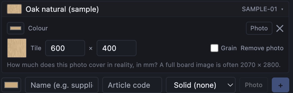
One tip: it does not need to be exact to the millimetre. It needs to be right to roughly ten percent. Measure the sample, or read the board size off your supplier’s data sheet.
Article code and grain direction
Two small fields that pay off later in the workshop.
The article code is your supplier’s reference. Fill it in and it appears on the buying list in your project dossier, next to the hinges and the runner sets — so whoever places the order has the code right there, instead of hunting through a catalogue for the decor you meant.
The grain switch tells the app whether this decor has a direction. Turn it on for wood and the nesting will never rotate a part by 90° to save material — because a door with the grain running the wrong way ruins a whole front. For a plain colour you leave it off, and the nesting gets the freedom to pack the sheet tighter.
Where your decors live
Your own decors need a free account: they are stored in the cloud with your account, so they follow you to another computer and they travel with the projects you share with support. You can keep up to a hundred of them.
They stay private to your account. A decor you add never appears in anyone else’s library and is not added to our collection. Our own collection is made in-house and deliberately brand-free; the branded material is yours, for your own designs.
May you use your supplier’s files?
A fair question, and worth a moment’s thought. A photo you took yourself of a sample you own is your own image — no doubt there. The material sets that manufacturers publish are a different matter: they are the manufacturer’s property, and what you may do with them is set out in that manufacturer’s terms.
Most publish those sets precisely so their customers can visualise projects in their decors, which is exactly what you are doing here — and what you upload stays inside your own library. Still, the terms are theirs, not ours. If you plan to lean on a supplier’s material for commercial work, read what they allow, or ask them. It is usually a short e-mail and a friendly answer.